In India, the invite isn’t a PDF attachment — it’s the first impression of your chapter’s professionalism. A blurry JPEG forwarded seventeen times says “we’re busy.” A crisp hosted page with speaker photo, map pin, and one-tap RSVP says “we respect your time.”
Lead with the one line people forward
When a BNI member shares a visitor invite in their status, the preview text matters more than your logo. Write a single sentence hook under 90 characters: “This Tuesday: dual speakers on export logistics + open visitor slot — Hilton Vadapalani, 7:30 AM.”
If your invite needs scrolling before the date and venue, you’ve already lost the secretary who forwards it.
Rotary clubs add fellowship context in the subhead — “Weekly meeting & vocational talk” — so members know it’s not a fundraiser pitch. Lions chapters highlight the service moment: “Eyecamp planning — your 30 minutes shapes 200 screenings.”
Mobile-first isn’t a buzzword — it’s WhatsApp reality
Eighty-plus percent of chapter traffic hits the invite on a phone between meetings. That means:
- Thumb-zone CTA — RSVP or “Add to calendar” above the fold, not buried under speaker bios.
- Tap-to-call venue — hotel switchboards frustrate; Google Maps deep link doesn’t.
- Readable type at 16px minimum — your president’s reading glasses will thank you.
- Poster weight under 500KB — if you must share an image, compress it; better yet, share the link.
The anatomy of a high-RSVP invite page
After reviewing dozens of Chennai chapter pages, the pattern is consistent. Winners include:
- Chapter name + meeting number (BNI) or week theme (Rotary)
- Date, start time, hard stop time
- Speaker names with one-line credibility (“18 years in customs clearance”)
- Visitor policy in plain language — fee, dress, parking
- Referral-friendly OG image for WhatsApp link previews
Losers include: twelve sponsor logos before the agenda, autoplay video, PDF-only invites, and “TBD” anywhere visible.
Timing the send — Indian edition
Send the primary invite 72 hours before the meeting — early enough for calendar blocking, late enough that it feels fresh. Reminder at T-24 hours for visitors only; members get a lighter nudge in the chapter group at T-12 hours with the same link (never a new link — analytics break).
Design that feels human, not template-fatigue
Premium Meeting Pro layouts work because they mirror the energy of the room — warm photography, dual speaker cards, subtle club colours. Free weekly starters keep typography clean and let content breathe. The goal isn’t Cannes Lions creative; it’s instant recognition that this is your chapter’s meeting, not a generic forward.
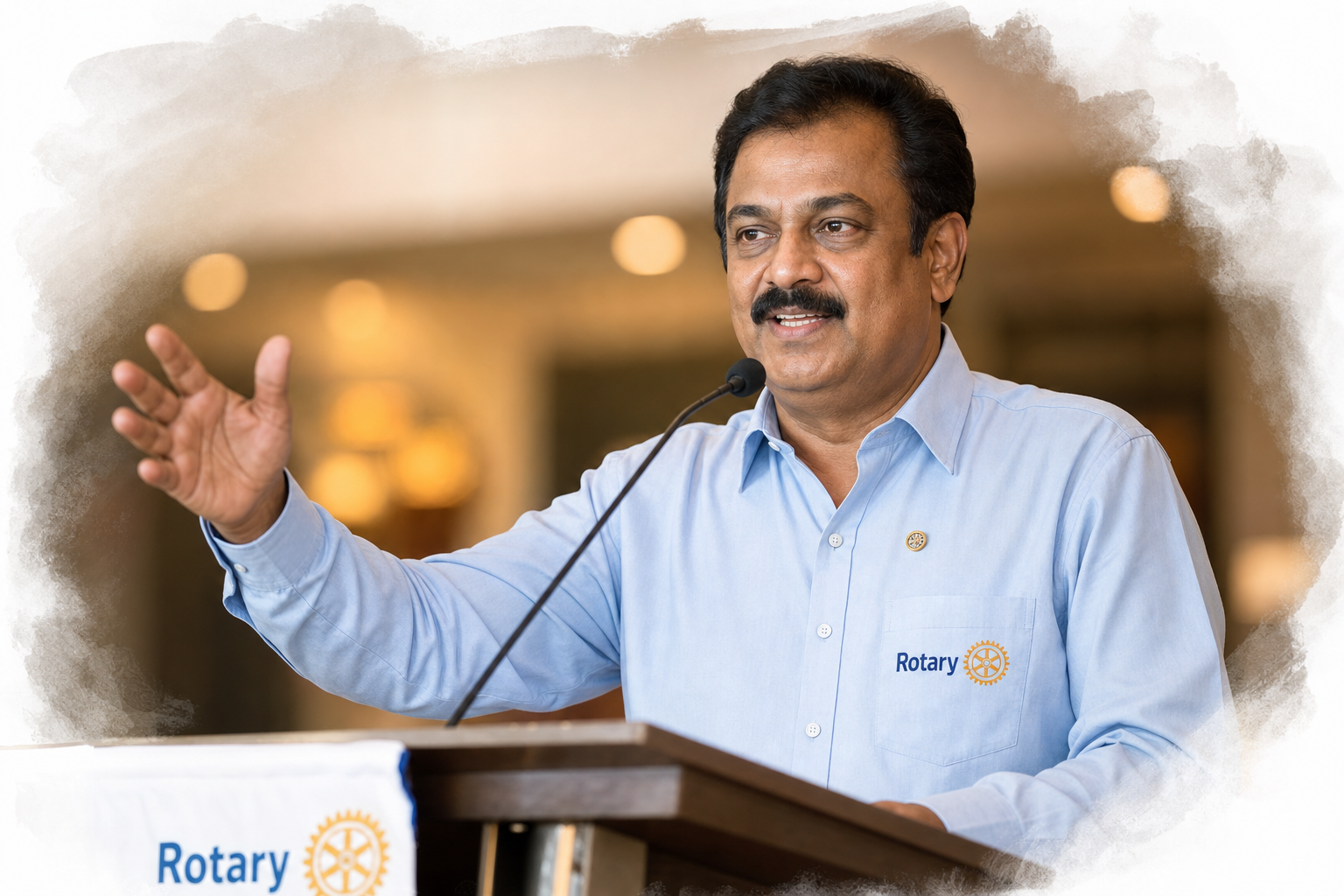
Use real speaker headshots — even phone portraits beat stock silhouettes. Crop consistently. Match the invite palette to your chapter banner so members feel continuity from chat to ballroom.
Measure what you send
With Glow analytics, track link opens by referrer — WhatsApp vs. email vs. QR poster at the lobby. If opens spike but RSVPs lag, your CTA is broken. If neither moves, your subject line is wrong. Invites are experiments; treat them that way.
The chapters growing fastest aren’t sending more messages. They’re sending one beautiful link that members are proud to attach their name to.